An idea is only the beginning. While starting a new project, there is a certain excitement.
A need and a want to innovate, to bring something new to the table. And all that is fine and dandy, but after the initial romance dies down, the time comes to execute that idea. The pursuit of a pixel perfect design.
During a website design project, a few things may get overlooked. While every page has its own features and specialties, it becomes a little difficult to bring consistency throughout the design. After all, a website should maintain the same look and feel throughout. Below is a design checklist, you should keep in mind while creating a website to optimize user experience and complement your inbound marketing efforts.
Elements of a Design Checklist
- Color: Before starting the design phase of a website, you must have decided on a color palette. Note down the hex codes of each color in the palette so you can have the same colors throughout your website. Using a color picker tool may not be the best idea because colors can vary from pixel to pixel. Hence, make sure you’ve jotted down the right hex codes.

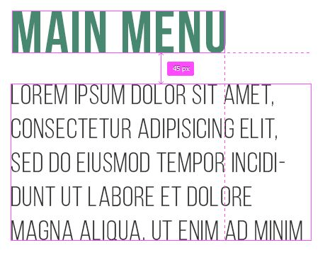
- Margins & Paddings: Every page on the website should have the same margins. The space from the Main Menu to the text or the space between images and text should be the same on every page. If you have a textbox, then each textbox should have the same padding. For example, if a textbox has a 15px padding, then every text box should have a 15px padding. You need to set your margins and paddings according to your design.
Icon Sets Standardization: Most websites nowadays have a graphic appeal to them. They play with images and icons to represent their products or services. With an array of free icons available online, it becomes very easy to use different icons without consuming much time. However, a drawback could be that not every icon you need may be available in that particular icon set. In such cases, you’ll probably search for the icon you need separately. That may kill consistency because every icon set has its own unique identity. The stroke width, the shadows, the colors and how they go well together are all part of the icon set’s identity. If you can’t find all the icons you need, don’t hesitate to create your own. It may take a little while longer, but you’ll have elements on your website, that you can call your own.
Once you’ve finalized your own icon set, make sure it’s standardized. Every icon should have the same stroke, the same color palette, and the same dimensions. For example, if you have an icon with a circular background, make sure every icon has that same colored circular background.
Line Spacing: In trying to finish a project, which is inching towards the end. Small details such as line spacing tend to get overlooked. The text on every page should be uniform. Each sentence should have the exact same line spacing as it did on the previous page. Test out which line spacing works for your type and how readable it makes your content. The content on your website is one of the most valuable assets of your website. Make sure people can read it without any distractions.
- Text Consistency: One of the most important things to keep in mind is to have consistent text. Headings, sub-headings, paragraphs, links within paragraphs should all be clear and distinct. Just by looking at your web page, a user should be able to tell which pages they’re on, what the page is about and whether there are text links in the page. If a user is to quickly scan the page, they should be able to give a short brief about the page. That is why the text should be distinct. All the headings on your website should have the same font, font weight, font size, and color. The same goes for subheadings and paragraphs.

- Animation & Transitions: Keeping in line with today’s trends, many websites have animations and transitions to keep the user engaged. Giving the user an experience where they feel like they’re in control or they’re the ones in the driver’s seat has increased immensely. Transitions help in creating such an experience. A transition as small as hovering over a button, which changes its color can heighten the experience.
Hence, make sure every transition is accounted for. Say you have a Read More button, once you hover over it, the color changes from green to yellow. There will be many occasions where you’ll need to use this button. Every time, you insert the button in your design, it needs to have the same characteristics. Maintain consistency in your design. If you’re looking for some really cool inspiration regarding transitions and animations, then be sure to check out: Button Transitions- Form Design: There may be sections on your website, where you’ll ask your users to fill up a form. Whether it’s their contact information or even a subscription sign-up; a form will be involved. You need to decide which colors the field will be, what’ll happen when someone clicks the Submit button; if there is an error in submission how it’ll show up.
Every detail needs to be the same throughout every form of the same category. You may have different forms for different categories, like for a Newsletter sign-up the form would be a little different from, say, a contact information form. However, don’t go overboard with the differences. Limit the difference to color, so a user can recognize which form is which immediately. The way the forms function should be the same.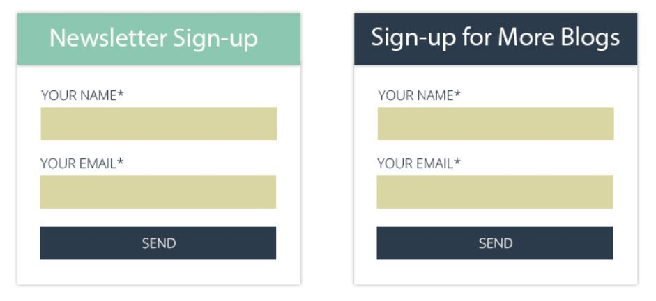
- Navigation: The way your website flows together is very important. You don’t want your user to get lost and become frustrated. Just by looking at any page on your website, it should be crystal clear as to where to go next, how to get back, how to browse through other sections of the website. If your website’s navigation is poorly thought through, a user may not return to it. If you’re doing a website redesign, the best way to figure out navigation is by combing through its analytics.
Quality of Design
- Notes for Developers: When you’re designing a website and someone else is developing it, give every detail to the developers. You’ve imagined the website and given them a folder filled with PSDs and JPEGs, however just by looking at it, a developer might not know which transition is supposed to go with which button. Keep making notes for the developer to make their process smoother. After all, they’re the ones who will bring your design to life.
- Reference Websites: If you have websites that are aspirational, then share those websites with the developer. Keep a note of those websites and write down their plus points and even their flaws (if there are any). If you like a certain transition on that website, tell your developer that this is how you’ve thought your transitions to be like. It helps a great deal if the developer can see and feel the effect of the transitions first hand.
- Scalability: Always keep in mind that your website may have pages added to it. It may see a lot of traffic at once. Your website should be able to handle that. The design of your website shouldn’t be dependent on a set number of pages, or an influx of traffic.
- Create graphics that are web-friendly and don’t take too much time to load. If you have icons, then make them as vectors.
- Invisible Design: A good design is an invisible design. Something that you don’t even notice you’re using. Your buttons shouldn’t look jarring, your images shouldn’t stop the flow of content, your icons shouldn’t look out of place. Keeping these details in mind should help you make your design so smooth that it flows like one big piece of beautiful artwork.
- Less Time, More Quality: While keeping the above list in mind, you should also think about who your target audience is. Nowadays, the attention span of an average user is limited to only a few seconds. As a matter of fact, according to a study conducted by Microsoft, the average attention span of humans is only 8 seconds. Hence, your target audience will most likely have a short attention span as well, unless you’re targeting to an alien race. You need to provide quality content and a design which is easy to navigate.
- If Ain’t Broke, Don’t fix it: The usual design practices are used for a reason. People are familiar with them. If a person sees three lines stacked on top of each other, they know it’s the Menu (called a Hamburger button). If they see a criss-cross sign, then they know it’ll be used to close something. Don’t try to innovate to such an extent that a user gets confused. Use the familiar icons, it will save time and make your website user-friendly.
Is this menu ≡ still working for you or it’s not on the menu any more? #MobileApp #WordyWednesday pic.twitter.com/ccPUEvEwjl
— Niswey (@Niswey) November 25, 2015
- Hypotext: Since the attention span of humans is very short, a lot of text can be discouraging. Using hypotext can help to a certain extent. Hypotext is used to reveal extra information on-demand. It looks and acts like a normal link, however, it doesn’t redirect the user to another page. It just expands the rest of the information linked with it. Try to incorporate hypotext into your design if you have a content heavy website.
Too long; didn’t read? Well here’s a solution. #BlogWriting#WordyWednesday via https://t.co/vCNI1Xy68i pic.twitter.com/8TSaFO2Qz6
— Niswey (@Niswey) December 16, 2015
Keeping in mind the above design checklist, you can create a website that has a spectacular design consistency. It should all look and feel as if it belongs to one entity. This can get a little drab if you’re doing constant changes. So be sure and consistent throughout. Take a web page that you feel fulfills all your design aspirations and use that as a benchmark for text, margins & paddings, colors, and any other design element that requires consistency.
However, before you get into the nitty gritty design, you should have everything else in place.
Designing a website isn’t just to spruce things up a little, there should be a reason behind it.
Spending the time and money on a huge project should be justified. Your website is usually the first thing people see. It can also be called the face of the company, hence make sure your website’s design does justice to you and your audience.

